 10fa71e2a7
Based on the Figma DS design by Alex, a mono date-picker
component has been added. It uses react-aria headless ui
component capabilities, with downshift headless ui component.
React-aria was not supporting by default dropdown menus to
select months and years. We could not reuse Popover component
from react-aria because we are not using their headless ui
component for the button one. Clicking on the toggle calendar
button triggers both the button and the popover click outside
events. React-aria button uses a custom onPress props that is
disabled by their popover. Instead, I have implemented a simple
custom hook. This is the first acceptable version of the component.
Some minor user interaction are missing. This first component
doesn't support time selection.
- Atomic: We follow atomic design principles.
- Modular and Reusable: Each component is designed to be self-contained and reusable across different projects, promoting consistency and saving development time.
- Accessibility-focused: Our components prioritize accessibility standards, making them usable and inclusive for all users.
- Design tokens based: We use design tokens to ensure consistency between design and code and allow high customization.
- React based: at the moment we only support React, but we are open to other frameworks, feel free to contribute !


🔎 Preview
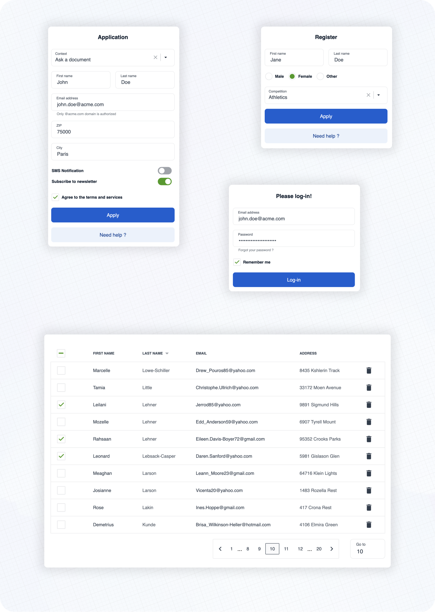
Here are some examples of real life usage of Cunningham components.
See the documentation 📚 to learn more about customization, typography, spacings and available components!
⚡️ Getting started
➡️ First, install the library
yarn add @openfun/cunningham-react
➡️ Then, add this script to your package.json file
{
    "scripts": {
        "build-theme": "cunningham -g css -o src"
    },
}
➡️ Then, in order to generate the css file, run
yarn build-theme
It will generate a file named cunningham-tokens.css.
➡️ Then, add these lines at the top of your main stylesheet file:
@import "@openfun/cunningham-react/fonts"; // Imports default fonts ( Roboto ). You can also import fonts by yourself.
@import "@openfun/cunningham-react/icons"; // Imports icons ( Material Icons ).
@import "@openfun/cunningham-react/style"; // Imports the default theme.
@import "cunningham-tokens"; // Imports the file you just generated.
Please take a look at customization documentation for more informations about the
cunninghamcommand line tool and to customize your local theme.
We're done! 🎉
To ensure everything works well, let's test rendering a component, such as the Button for example.
Now please see the documentation 📚 to learn more about customization, typography, spacings and available components!
Contributors
Contributing
This project is intended to be community-driven, so please, do not hesitate to get in touch if you have any question related to our implementation or design decisions.
Please see our contributing guidelines.
License
This work is released under the MIT License (see LICENSE).