 111bb677c4
It was considered as a bad practice to include array indexes in list
elements keys even though it was made this way in the documentation. We
removed them and also decided to drop the use of options value in the
keys too to the profit of optionToValue which can never be undefined or null.
This changes caused test crashing due to the fact that it made the useSelect
onStateChange trigger a onBlur event that was causing the first option of the
list to be selected automatically, which was a really weird behavior. Before
it was not happening because newSelectedItem was not defined, using the
new keys made it defined, we don't 100% understand why yet.
- Atomic: We follow atomic design principles.
- Modular and Reusable: Each component is designed to be self-contained and reusable across different projects, promoting consistency and saving development time.
- Accessibility-focused: Our components prioritize accessibility standards, making them usable and inclusive for all users.
- Design tokens based: We use design tokens to ensure consistency between design and code and allow high customization.
- React based: at the moment we only support React, but we are open to other frameworks, feel free to contribute !


🔎 Preview
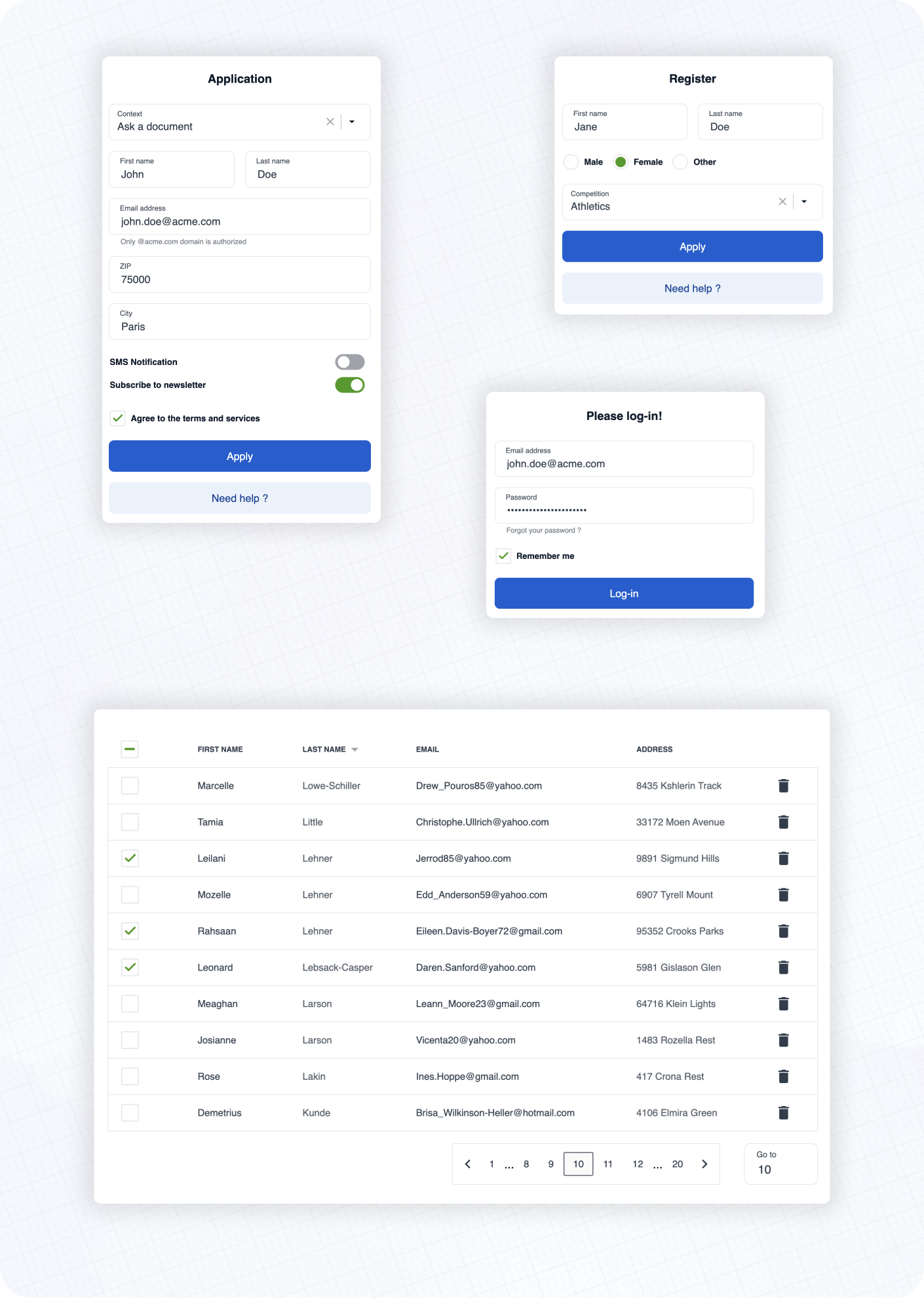
Here are some examples of real life usage of Cunningham components.
See the documentation 📚 to learn more about customization, typography, spacings and available components!
⚡️ Getting started
➡️ First, install the library
yarn add @openfun/cunningham-react
➡️ Then, add this script to your package.json file
{
  "scripts": {
    "build-theme": "cunningham -g css -o src"
  }
}
➡️ Then, in order to generate the css file, run
yarn build-theme
It will generate a file named cunningham-tokens.css.
➡️ Then, add these lines at the top of your main stylesheet file:
@import "@openfun/cunningham-react/fonts"; // Imports default fonts ( Roboto ). You can also import fonts by yourself.
@import "@openfun/cunningham-react/icons"; // Imports icons ( Material Icons ).
@import "@openfun/cunningham-react/style"; // Imports the default theme.
@import "cunningham-tokens"; // Imports the file you just generated.
Please take a look at customization documentation for more informations about the
cunninghamcommand line tool and to customize your local theme.
We're done! 🎉
To ensure everything works well, let's test rendering a component, such as the Button for example.
Now please see the documentation 📚 to learn more about customization, typography, spacings and available components!
Contributors
Contributing
This project is intended to be community-driven, so please, do not hesitate to get in touch if you have any question related to our implementation or design decisions.
Please see our contributing guidelines.
License
This work is released under the MIT License (see LICENSE).