 be3deea177
This commit revises the color system to enhance modularity and
accessibility. It updates the color classes in the documentation and
stories to reflect the new semantic naming conventions. Additionally,
the structure of the theme configuration has been changed from `theme`
to `globals`, ensuring a more organized approach to color management.
New migration documentation has been added to guide users through the
transition to the updated system, including steps for updating CSS
variables and button props.
- Atomic: We follow atomic design principles.
- Modular and Reusable: Each component is designed to be self-contained and reusable across different projects, promoting consistency and saving development time.
- Accessibility-focused: Our components prioritize accessibility standards, making them usable and inclusive for all users.
- Design tokens based: We use design tokens to ensure consistency between design and code and allow high customization.
- React based: at the moment we only support React, but we are open to other frameworks, feel free to contribute !


🔎 Preview
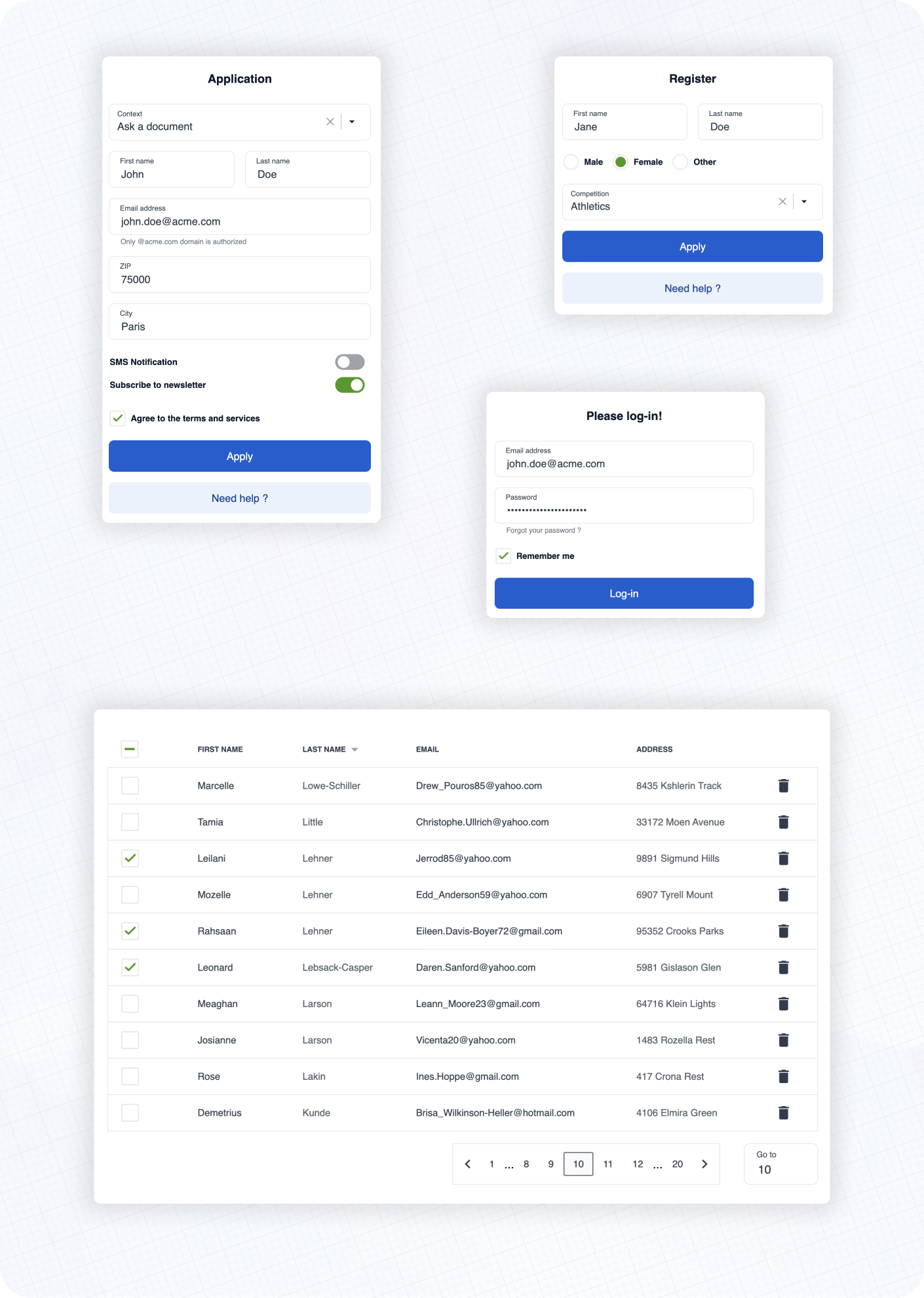
Here are some examples of real life usage of Cunningham components.
See the documentation 📚 to learn more about customization, typography, spacings and available components!
⚡️ Getting started
➡️ First, install the library
yarn add @openfun/cunningham-react
➡️ Then, add this script to your package.json file
{
  "scripts": {
    "build-theme": "cunningham -g css -o src"
  }
}
➡️ Then, in order to generate the css file, run
yarn build-theme
It will generate a file named cunningham-tokens.css.
➡️ Then, add these lines at the top of your main stylesheet file:
@import "@openfun/cunningham-react/fonts"; // Imports default fonts ( Roboto ). You can also import fonts by yourself.
@import "@openfun/cunningham-react/icons"; // Imports icons ( Material Icons ).
@import "@openfun/cunningham-react/style"; // Imports the default theme.
@import "cunningham-tokens"; // Imports the file you just generated.
Please take a look at customization documentation for more informations about the
cunninghamcommand line tool and to customize your local theme.
We're done! 🎉
To ensure everything works well, let's test rendering a component, such as the Button for example.
Now please see the documentation 📚 to learn more about customization, typography, spacings and available components!
Contributors
Contributing
This project is intended to be community-driven, so please, do not hesitate to get in touch if you have any question related to our implementation or design decisions.
Please see our contributing guidelines.
License
This work is released under the MIT License (see LICENSE).