 cfdac8dba9
Previously we were using standard Roboto Font but we were struggling to
get the same boldness as the ones from the Figma sketches. It appears
that Figma uses Roboto Flex, so by installing it we can now nearly
perfectly align our visuals with the ones form the sketches. I had to
do some custom tweaks with the weights of the font because if we
use exactly the same font-weight as in Figma the render is still different.
- Atomic: We follow atomic design principles.
- Modular and Reusable: Each component is designed to be self-contained and reusable across different projects, promoting consistency and saving development time.
- Accessibility-focused: Our components prioritize accessibility standards, making them usable and inclusive for all users.
- Design tokens based: We use design tokens to ensure consistency between design and code and allow high customization.
- React based: at the moment we only support React, but we are open to other frameworks, feel free to contribute !


🔎 Preview
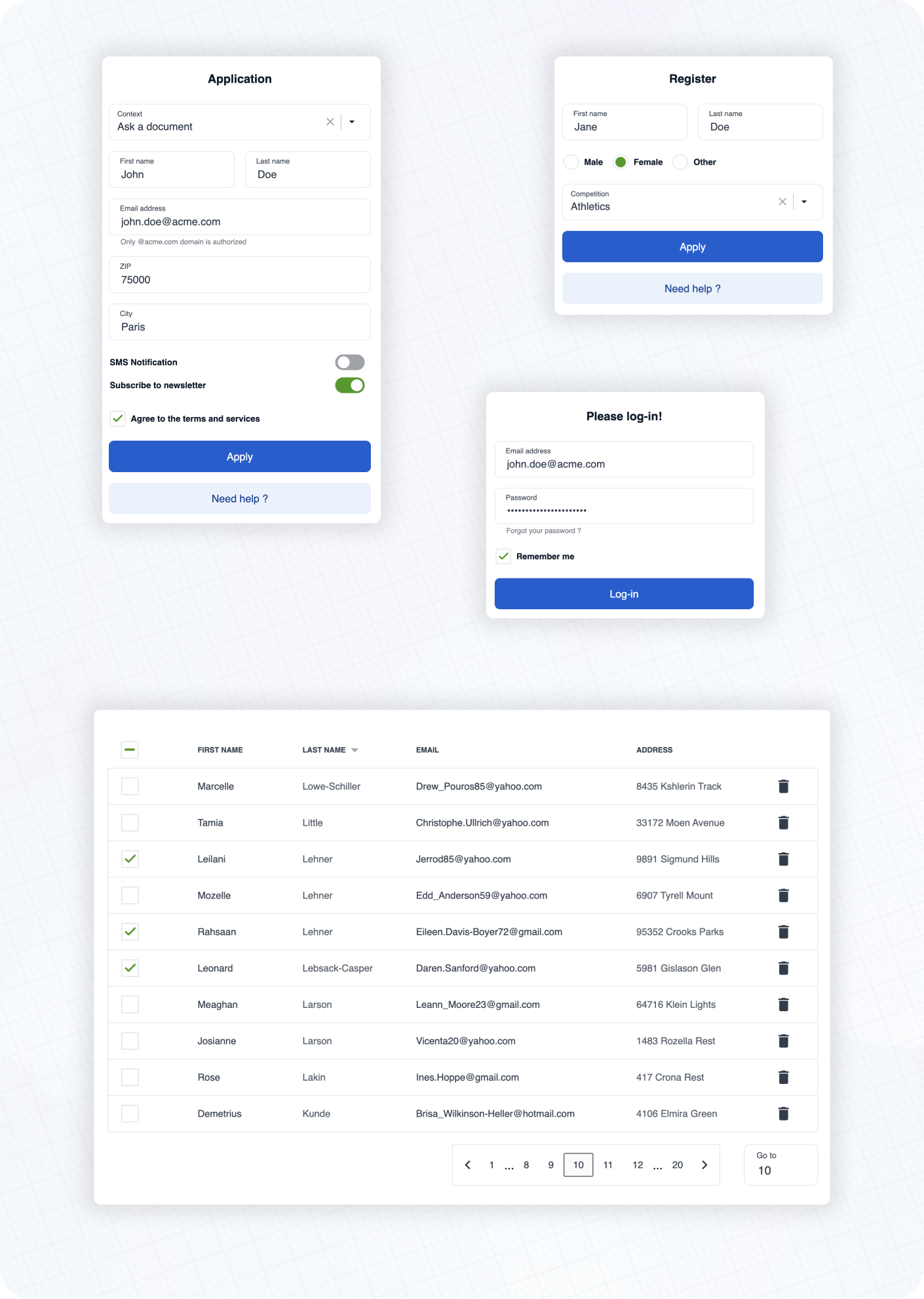
Here are some examples of real life usage of Cunningham components.
See the documentation 📚 to learn more about customization, typography, spacings and available components!
⚡️ Getting started
➡️ First, install the library
yarn add @openfun/cunningham-react
➡️ Then, add this script to your package.json file
{
    "scripts": {
        "build-theme": "cunningham -g css -o src"
    },
}
➡️ Then, in order to generate the css file, run
yarn build-theme
It will generate a file named cunningham-tokens.css.
➡️ Then, add these lines at the top of your main stylesheet file:
@import "@openfun/cunningham-react/fonts"; // Imports default fonts ( Roboto ). You can also import fonts by yourself.
@import "@openfun/cunningham-react/icons"; // Imports icons ( Material Icons ).
@import "@openfun/cunningham-react/style"; // Imports the default theme.
@import "cunningham-tokens"; // Imports the file you just generated.
Please take a look at customization documentation for more informations about the
cunninghamcommand line tool and to customize your local theme.
We're done! 🎉
To ensure everything works well, let's test rendering a component, such as the Button for example.
Now please see the documentation 📚 to learn more about customization, typography, spacings and available components!
Contributors
Contributing
This project is intended to be community-driven, so please, do not hesitate to get in touch if you have any question related to our implementation or design decisions.
Please see our contributing guidelines.
License
This work is released under the MIT License (see LICENSE).